Causal Explanations Considered Harmful
On the logical fallacy of causal projection
View on SubstackWe like to think in terms of cause and effect. Causal statements leave us with a sense of knowledge and control: they allow us to answer “what if” questions, and promise us leverage over reality—if you want to kill the effect, kill the cause.
But many real-world systems are poorly modeled by causality. Domains like economics, sociology, psychology, and ecology are full of feedback loops, where effects turn back on their causes. And when we try to impose causal explanations on these systems, we end up confused.
Let’s look at a few examples, and see how we can do better.
Outline
A Motivating Example
Scott Alexander recently reviewed Bobos In Paradise, in which David Brooks makes a fantastical causal claim:
The daring thesis: a 1950s change in Harvard admissions policy destroyed one American aristocracy and created another. Everything else is downstream of the aristocracy, so this changed the whole character of the US.
Brooks cites a bunch of statistics about rising crime rates and children born out of wedlock in the decades that followed. Scott finds the argument compelling:
These are the same data purportedly explained by the lead-crime hypothesis, where leaded gasoline poisoned young people’s brains and made them more impulsive. Last I checked this hypothesis had survived the replication crisis pretty well and continued to seem plausible. But Brooks’ theory is among the best alternatives I’ve heard.
Scott even lists a bunch of other effects that may have spilled out of Harvard’s admissions change, including new architectural styles, culture wars, and political polarization. (To be fair, he acknowledges that all this is speculative—he’s just taking Brooks’ idea and running with it.)
But here’s a competing hypothesis: a lot of crazy shit happened in the US during the 50s and 60s. Some examples:
The civil rights movement. Hippies. Modern transistors. The assassinations of JFK, RFK, and MLK. Free love. LSD. The share households with a television goes from 9% to 95%. The Vietnam War. The rise of Silicon Valley. The first live TV broadcast. And yes, an Ivy League school changed its admissions policy.
None of these things strictly caused the others. LSD fueled the hippies; hippies in turn spread LSD around the country. Vietnam protests energized the hippie movement, which then created a culture clash and cemented mainstream support for the war. TV broadcasts built opposition to the war, but also fear about LSD. MLK led the Civil Rights Movement; the publicity got him assassinated; the resulting riots forced congress to pass the Civil Rights Act. And shortly after Harvard changed its admissions policy, Timothy Leary began feeding the new undergraduates psychedelics.
All these things contributed in their own ways to the massive sociocultural shift that took place in the second half of the 20th Century.
If you ask me what the “main cause” was, I’ll say LSD. But that’s because I write about psychedelics a lot. If you ask a war buff, they’ll tell you it was Vietnam. If you ask an expert on Black History, they’ll tell you the civil rights movement changed everything.
And all of us are right! We can each back up our claims with a convincing set of syllogisms. But each explanation appeals to a common fallacy: they impose causal explanations on a system as dynamic and chaotic as sociology.
Causal Diagrams
Causality is easy to visualize: all we need are circles and arrows. So forgive me as I introduce a technical term: classical causality is best modeled as a Directed Acyclic Graph.
Directed Acyclic Graphs
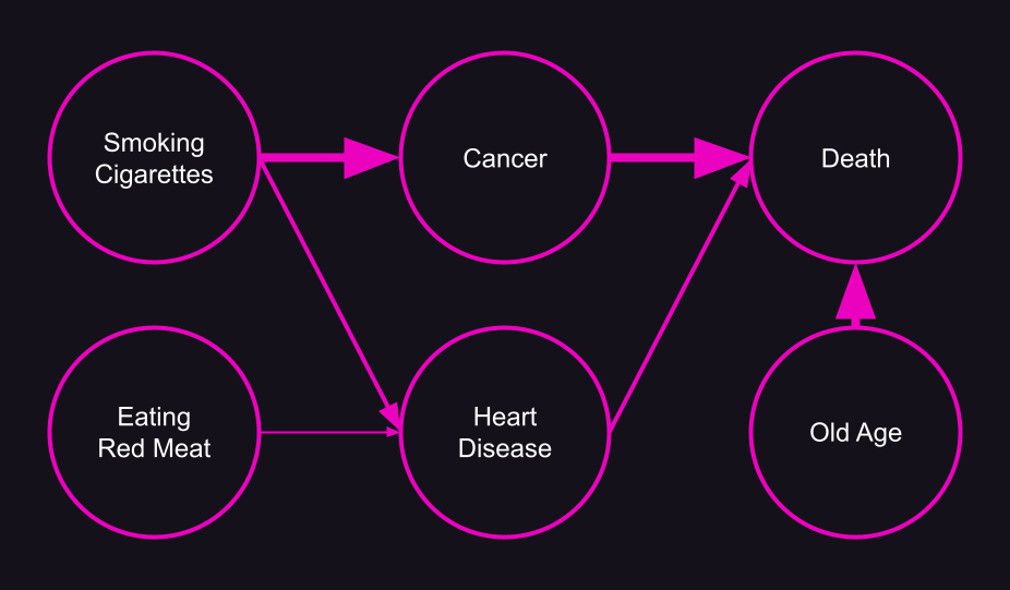
We like to visualize causal relationships like this:
This is a simple example of a Directed Acyclic Graph (DAG). A “graph” in this sense is a diagram that shows how different things are connected together; “directed” means the connections are arrows; “acyclic” means the arrows only go one way—if you start on node A, and follow the arrows, you’ll never get back to A.
We can make our mortality DAG above a little more complicated without breaking these rules:
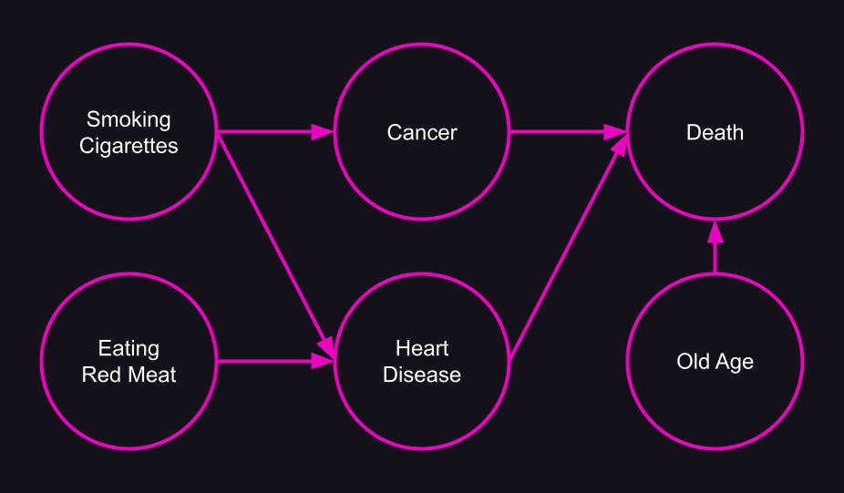
Diagrams like these are very useful! They let us ask questions like, “Am I at risk for heart disease?” or “How should I change my lifestyle if I don’t want to die?”. You can pick any node you care about, and follow the arrows forward or backward to learn more about it.
We can even enhance the graph with a little more information by giving each connection a weight: thicker arrows mean there’s a stronger level of causation.
This weighted DAG makes it easy to see that red meat has a lower effect on mortality than smoking cigarettes.
DAGs are incredibly helpful when studying well-behaved systems. They do a particularly good job at describing things that are man-made, like machines, legal codes, electronic devices, and software architectures.
But most natural systems are too complex for a DAG.
Causal Loop Diagrams
Natural systems are full of feedback loops, makes them much harder to reason about. But by relaxing the “acyclic” requirement, we can turn our DAGs into Causal Loop Diagrams (CLDs).
Here’s an example showing how population size, birth rate, and death rate affect each other:
(Here, instead of using the widths of lines to show their weights, I’ve labeled them as positive or negative. We could also use numbers to show their relative strength.)
We can see there are two feedback loops:
As the population grows, there are more people reproducing, which increases the birth rate. This drives up the population even further.
As the population grows, there are more people around to die, which increases the death rate. But as the death rate goes up, the population decreases.
The first loop is an example of positive feedback—as one variable increases (or decreases) so does the other. Positive feedback loops tend to be highly unstable; if there were no death in this picture, the population would explode exponentially.
The second loop is an example of negative feedback—as one variable increases, the other decreases, and vice versa. Negative feedback loops create balance.
It’s pretty easy to spot the difference between the two: the positive loop has matching “+” signs, while the negative loop has one “+” and one “-”. Does this hold for bigger loops? Let’s expand the model a bit.
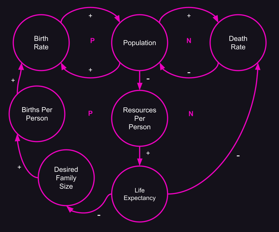
You can see we’ve created two more loops in our population diagram. I’ve labeled each loop “P” for positive or “N” for negative (often you’ll see these as “R” for reinforcing and “B” for balancing, along with a directional indicator).
How do you tell a positive loop from a negative one? One trick is to run a mental simulation: start with an increase in population, and work through the effects at each node along the loop. If you end up with an increase in population, it’s positive; if you end up with a decrease, it’s negative.
A simpler strategy is to count the minus signs along the loop—an odd number indicates a negative loop (since two minus signs cancel each other out).
A Totally Made Up Example
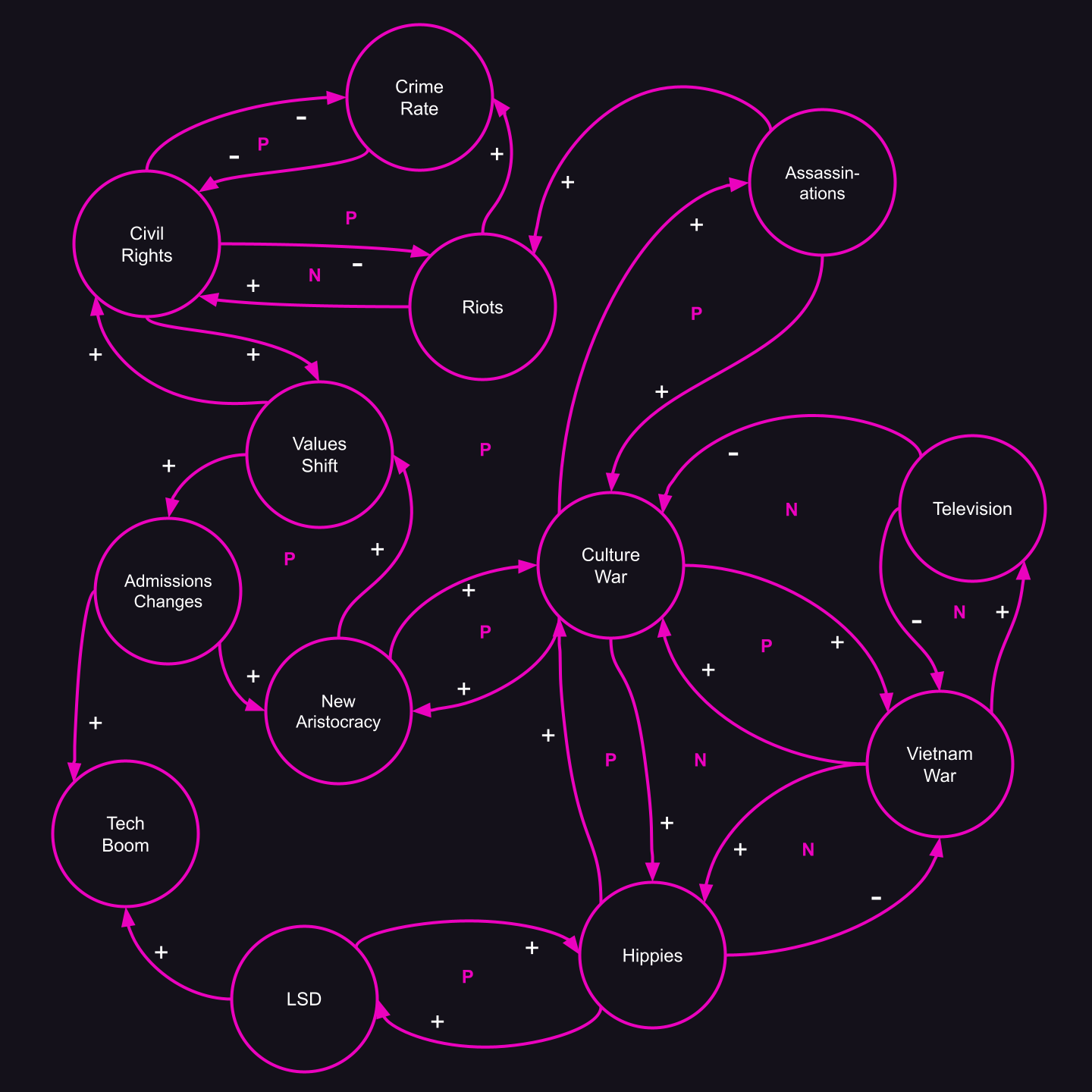
Let’s see if we can apply a CLD to the values shift that started in the 50s and 60s.
Exactly where I drew the lines, and which directions they flow, isn’t super important. What’s important is how much more complicated this diagram is compared to our causal diagram for mortality.
For example, we might ask a counterfactual question: what if there had been no political assassinations? Would we still have had such a large increase in civil rights?
The answer is unclear. We might surmise there would be fewer riots, and therefore less crime, which would improve civil rights. But riots are also helpful for instigating improvements to civil rights. Or maybe the underlying values shift would have been enough to drive civil rights improvements. But without assassinations to fuel the culture war, would there still have been enough of a values shift?
This is the issue with dynamic systems: it’s incredibly hard to make predictions or evaluate counterfactual scenarios. Tiny changes in conditions can cause different feedback loops to dominate, leading to wildly different outcomes.
Our response to this structural uncertainty is denial. We cope by adopting a strategy I’ll call causal projection.
Causal Projection
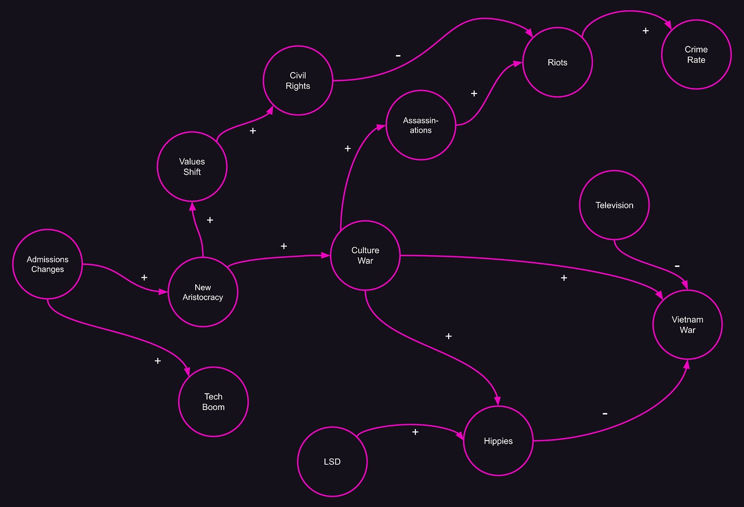
Causal projection is easy: just remove arrows from the CLD until you’re left with a DAG. If you’ve got a pet theory in mind, like A causes B, it helps to start at node A and work your way down to B, removing any arrows that point backwards.
Et viola! We’ve recreated Brooks’ claim that changes in admissions policies led to an increase in the crime rate!
Interestingly (I didn’t plan this out!) the path from “Admissions Changes” to “Crime Rate” parallels Brooks’ argument:
[The new aristocracy’s] efforts to tear down the old customs and habits of the previous elite was not achieved without social cost. Old authorities and restraints were delegitimized [culture war]. There was a real, and to millions of people catastrophic, breakdown in the social order [assassinations and riots], which can be measured in the stunning rise in divorce, crime, drug use, and illegitimacy rates.
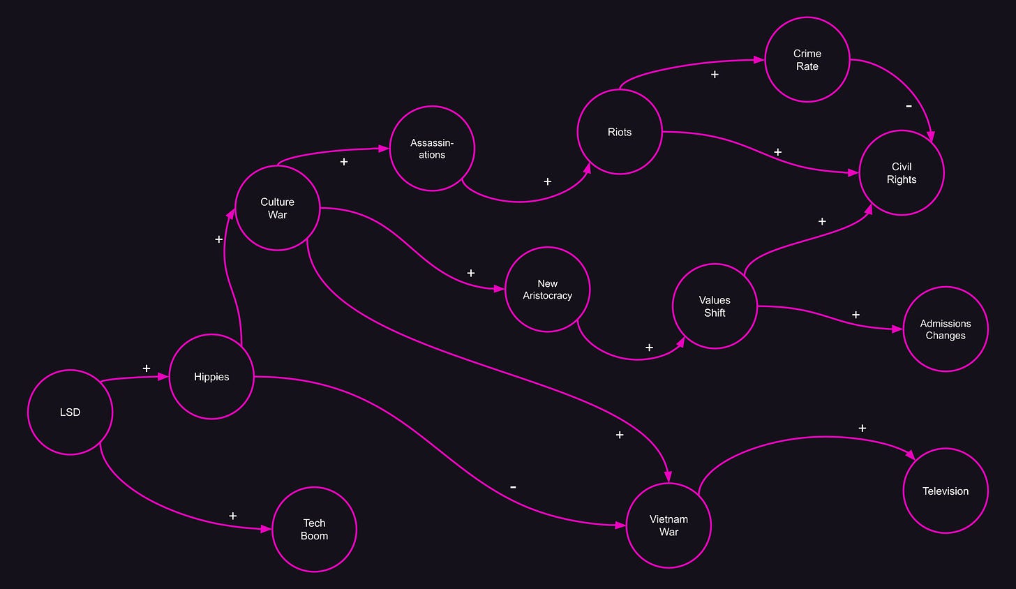
Of course, we can delete different arrows to make an entirely different argument:
Now you can see that LSD use caused Harvard to change its admissions policy!
Of course, when we make these kinds of arguments, we’re not being deliberately dishonest. We just discard or ignore facts that seem irrelevant. The discarded facts don’t necessarily run counter to our argument—they just connect secondary nodes. They might seem totally safe to discard.
For example, Brooks ignores the fact that the wider culture war—fueled by Vietnam and the hippie movement—potentiated the arrival of a new aristocracy. Or that a pre-existing shift in values might have influenced Harvard’s adoption of a meritocratic policy. Neither of these possibilities contradicts his thesis! But they lead to feedback loops that ultimately undermine it.
(Note: I haven’t actually read Brooks’ book, only Scott’s review—it’s possible he’s much more cautious about his claims. I’m just picking on him to make a point.)
Scoring Causal Explanations
Despite the fact that causal explanations hide complex realities, some causal explanations are clearly better than others. Is there a way for us to judge whether a causal explanation is a good one?
There is! Let’s look back at our “smoking causes cancer” diagram.
In reality, there are some more arrows in the mix, which could create cycles: people diagnosed with heart disease tend to cut back on meat; people like to smoke after a big meal, so we could say eating meat causes smoking; and maybe getting older causes people to smoke less.
So why should we accept the idea that smoking causes cancer?
The answer is that the arrows we’ve neglected are quite small—if I’d shown them in the diagram, their widths would be razor-thin, almost invisible. We haven’t done much damage to our picture of the world by removing them.
In general, we can give a score to any causal projection by summing up all the arrows that have been removed to support it. The fewer arrows you remove, and the smaller those arrows are, the better your argument holds up.
So every causal projection is a partial truth. The only question is how partial, and whether its explanatory power justifies the facts we had to sacrifice in the process.
Stay Skeptical
Once you seeing the world in terms of causal loops, it’s hard to unsee. Many of the biggest debates start to seem inane, with both sides cheering on their preferred etiology.
Some examples:
Did a supply shock cause current levels of inflation?
Did the FBI’s investigation of Hillary Clinton cause Trump to win?
Does social media cause depression?
Did the assassination of an archduke cause WWI?
Do lockdowns cause COVID to stop spreading?
Did SBF’s stimulant addiction cause FTX’s downfall?
Did BLM protests cause an increase in murders?
Do neurochemical issues cause anxiety?
In each debate, you’ll find domain experts saying, “well, actually, it’s kind of complicated…” only to be beaten down by partisans wielding causal projections like battle axes.
Both sides will make syllogistic arguments: A led to B, which led to C, and so on to Z, and every inference in the chain will seem sound. Some of these arguments hold up better than others, but in each case, there’s a complex web of feedback loops being ignored.
The key is to look for the gaps: what facts have been omitted? The omissions don’t need to contradict the thesis—they only need to be big and relevant. Even many tiny omissions can hide a feedback loop that undermines the argument.
We need to treat causal explanations with skepticism. They always hide the truth—all we can do is try to figure out how much.
Join the discussion on Substack!


